Welcome to the new Charlotte’s Web. When we say ‘new’, we’re still the ethical jewellery brand you have known and loved for almost 20 years, but today we take on a new look. We start a new chapter. And we are thrilled to share our refreshed brand identity with you.

Over the past few months, Charlotte, Lisa, and Emma have poured their hearts and souls into creating a new image for Charlotte’s Web. Something that would accurately depict the story of our ever-evolving sustainable jewellery brand while still retaining its core values. Armed with a plethora of colour palettes, iconic icon ideas, and new branding possibilities, we looked to Sarah at the Dossier Studio, and Karen at Karebou Web design both in New Zealand (we’re an international jewellery brand, you know!) to help us bring our vision to life. And we’re delighted with the results.
Today, we would like to take you on a three-part journey of our rebrand, with three blogs detailing how we came up with our new logo, website, and packaging. But first, let’s start with why we decided to rebrand Charlotte’s Web, what the new look means to us, and hopefully, what it means to you.
Inspired By Adventure, Ethically Created.
“Inspired by adventure, ethically created” is the new tagline of Charlotte’s Web, and we believe it captures the very essence of our brand. Charlotte spun her web nearly 20 years ago when overseas adventures inspired her to create the spiritual and spinning jewellery you have come to love today. But her passion for ‘Trade not Aid’ and commitment to sustainability is what made her bespoke jewellery brand stand out.
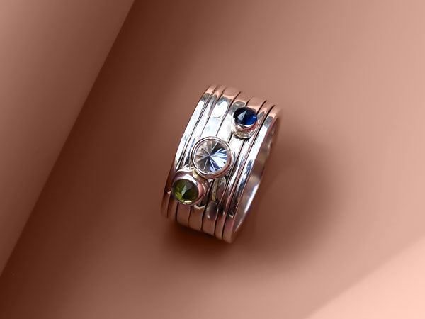
Every piece of Charlotte’s Web jewellery is ethically handmade by skilled artisans in India. We only use recycled silver and sustainable materials, our gold-plated pieces are 24-karat gold on sterling silver, and you’ll only ever find conflict-free gemstones in our eco-jewellery range. Charlotte handpicks every stone to ensure its authenticity, and she visits her teams in India regularly to ensure they receive fair salaries and always have good working conditions.

Our beautiful new packaging comes in recycled FSC paper, which you can recycle many times, and we make all our spinning rings, earrings, necklaces, and bracelets in small batches. You will not find mass-made, fast-fashion products here.
Sustainability has always been at the core of Charlotte’s Web; it is the foundation of everything we do, so we thought it was important to share this as part of our rebranding. We want our customers to shop confidently, knowing that their birthstone jewellery is ethically handmade, their spinning rings are sustainable in recycled silver, and their spiritual jewellery is as kind on the planet as it is on the soul. And it all started with a new colour.

The New Charlotte’s Web Colour
With the foundations of Charlotte’s Web deeply rooted in India, it made sense to look to the colour-rich landscapes of our homeland for colour inspiration. We make our handmade jewellery in Jaipur, the home of the pink city, so deciding on a colour palette saturated in Jaipur pink was easy. It is such a chic shade. Warm yet neutral, modern yet timeless, and combined with a flash of gold from the new Charlotte’s Web logo, it epitomises our ethical-luxe jewellery brand.

Let’s Talk About The New Charlotte’s Web Logo
We knew early on that we wanted our new logo to be font based (as opposed to icon-based) for a cleaner and more modern look. But we wanted something with personality and character: a font that would endure trends and age as beautifully as our bespoke jewellery collections.
Armed with our brief, Sarah got to work on a new Charlotte’s Web wordmark logo and provided us with pages of decorative designs ranging from lightweight and feminine to bold and confident. We found ourselves instantly drawn to her proposed wordmark, and with refinement, we came up with the logo you see on our website today.
Our new wordmark logo is elegant yet contemporary in its calligraphic style. It is undeniably romantic, too, with the first ‘C’ and last ‘e’ linked to the following letter to represent a web. We love how it sits confidently alongside other ethical jewellery brands. We adore how it quietly demands attention with its rhythmic flow.
And Our Icon…
When choosing a new icon for Charlotte's Web, we again looked to India for inspiration, this time focusing on Indian architecture and the iconic symbols that inspired many of the pieces in our ethical jewellery collection, such as the peacock feather, lotus flower, Diwali light, and crescent moon.

As a female team, we allowed our feminine energies to guide us, and Sarah developed a beautiful mosaic pattern incorporating several of the Indian influences that inspired us. But it wasn't quite right. After a few tweaks from Lisa and design jigs from Sarah, we had our final geometric design. We hope you love the new icon as much as we do!
Armed with our new colour and logo, we felt ready to move to the next step in our rebranding journey - our new website. We'll explain more in the next post.